Blood Bowl – A new stadium for a new season
You may have seen the game reports on here by Dino, with his Maulers playing different teams, like the Skycastle Titans or Altdorf Avengers, and with the topic of battle reports, I want to be prepared as well to host some Blood Bowl matches.
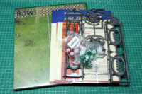
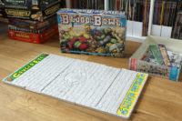
Therefore I got myself the basic game materials from Blood Bowl season two, covering the new pitch, templates and dice.
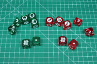
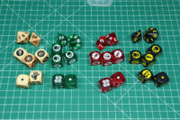
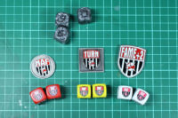
As for the dice, these are kept in the regular design of the newer Blood Bowl (dice) sets of season 1 (2016 edition), with three block die, two d6, one d8 and one d16. For comparison the NAF dice and token. I like the clear dice, especially the red ones, as they remind me of casino dice.
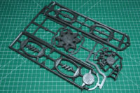
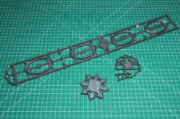
The templates are the same as the 2016's edition, dark grey plastic and a new throwing template, matching the bigger pitches since season one.
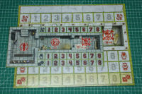
The new dug outs are much more compact compared to the old ones, about half the size. I would say that was a good decision to reduce the size, as a roster isn't that big and you can still place the reserve on there but have more space on the table. It is a bit darker than the other ones and has more contrast. It is double sided, to match both pitch designs.
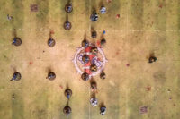
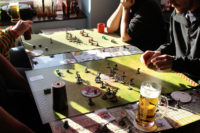
The pitch got bigger with the 2016 edition of Blood Bowl, as you can see here in comparison with a rollable pitch of the same measurements as the old one.
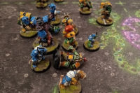
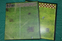
Here are the pitches from season 1 and season 2. Both are double sided, season 1 was brighter and taken from an actual, physical build pitch. A clean bright one from the empire and a more dirtier ork pitch.
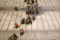
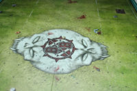
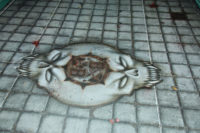
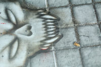
The pitch from season 2 were designed digitally (that's not a new thing, Dino covered his Underworld and Denizen pitch review), one in the know green design of the most known Blood Bowl pitches, and the other one with the grey astrogranite, we know from the old 2nd edition of Blood Bowl. Combining the skull with the new Blood Bowl logo is a great composition of the old and the new.
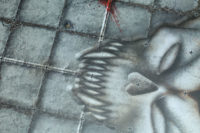
Unfortunately, the print isn't as sharp as the season 1 pitch, it is much more blurry and have to say on some parts rather sloppy done. For example the way the skull is placed upon the granite, is a very noticeable Photoshop filter. They didn't even post-process the edges...
Never the less, I am looking forward to place some of the teams from the good old times on these pitches.
Just need to find some backdrops and something for the side line. Maybe some sponsor boards, a score board and about two stands. There are a few mdf designs, but they look too flat to me, so have to see what would be a suitable option.



Leave a Reply